
Algonomy is a portmanteau formed by combining the word ‘algorithm’ with the suffix ‘nomy’, which signifies knowledge in a particular domain. And that precisely is who we are; we know algorithms and we know how to make it to create great customer experiences for consumer-facing businesses.
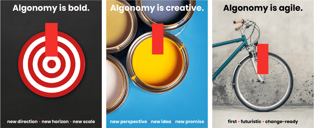
Just like the pioneers of modern digital retail, Algonomy as a brand believes that it is time to do away with fragile rules, guesswork and static segments and power ourselves with the ability to act in real time. It is time to be bold in digital transformation, creative in strategy and agile in decisions.
Algonomy is confident, knowledgeable and bold with an inherent spirit of discovery. We go first where others would prefer to follow. And if we keep a poker-face, it is not because we lack a sense of humour. Think of Algonomy as a young Indiana Jones.
Algonomy is bold creative agile .

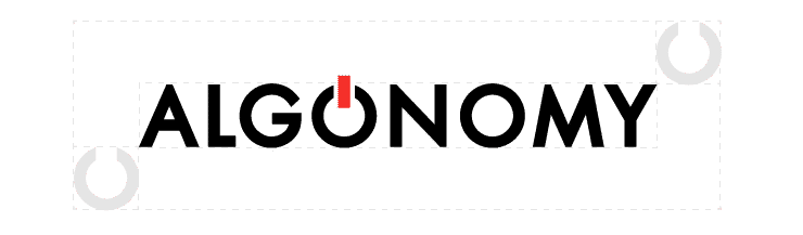
The Logo
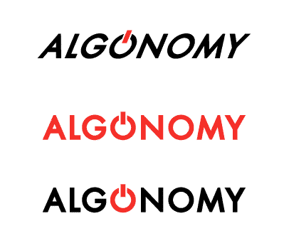
Our logo is the combination of a simple and strong word mark with the icon (flare).
The flare represents the power and the ability to always be ready for change.
The brand takes on a standard visual expression, but it also adapts to the environment such as taking the colors of an important day or holiday, supporting a cause, celebrating an event or person. The full logo or icon (flare) can be used to achieve this dynamic visual expression.
Check out their applications and permissions. We would appreciate it if you could follow these guides to make sure it always looks its best.

Safe Area
The safe area amplifies the impact of the logo and also ensures legibility. It guarantees the logo’s visual integrity without it having to competewith text or graphics.
The safe area is the assured by the height of the first O, without the flare.
This should be considered the minimum space required around the logo.

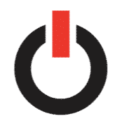
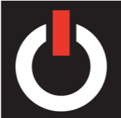
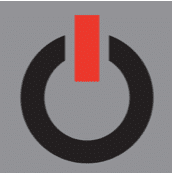
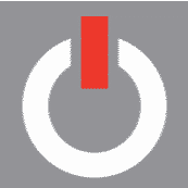
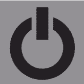
The Flare
The flare can be used for dynamic visual representation of the brand. But always, only in keeping with the values, purposes and character of the brand.
Its use where images resemble the O in Algonomy can lead to a dramatic visual representations. We have purposely limited its usage so that it creates a simple yet unique brand signature.
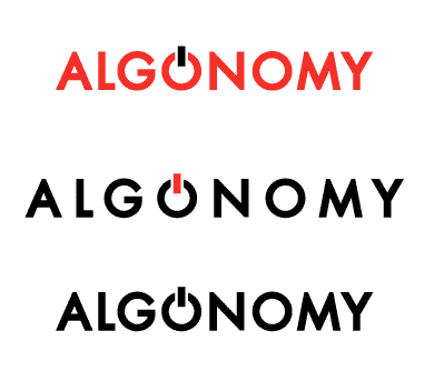
The flare can be used with the wordmark, but the wordmark should never be applied without the flare. When using the wordmark instead of the logo, please remember that the same safe area rules apply.

Flare Variations


Applications and Permissions
Proportions
To preserve legibility, the logotype never appears smaller than the following sizes:


Logo usage
Primary Versions
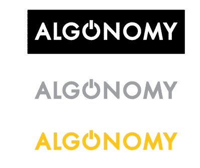
The black logo is used on light backgrounds and the white logo is used on dark colored backgrounds.
Mono Versions
If color is not an option for technical reasons, you are allowed to use the black or white logo options.
Photo Background
The black or white logo is used on noisy background photography to ensure the logo is readable.
Do not use the logo in the way show below.
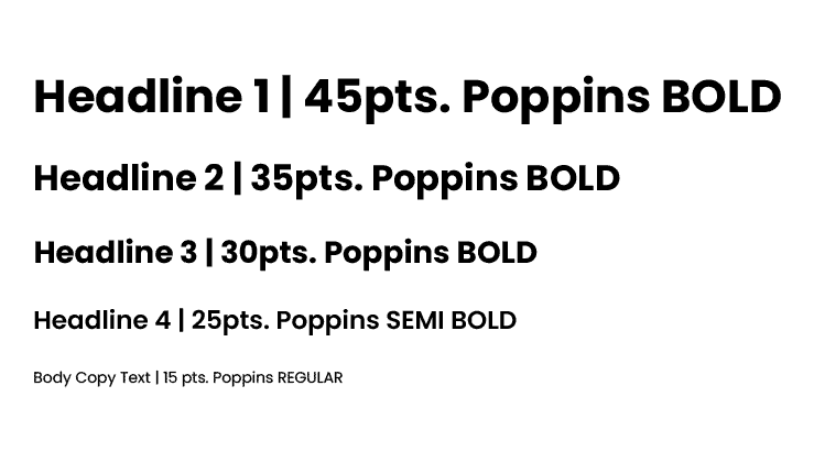
Typography
Our font family is modern, simple and universal – it guarantees the clarity of our communication. Beside you can check its universal application, however adjustments of body and size are allowed to maintain clear communication.

Graphic Elements
Circles and waves are elements in Algonomy’s visual design. But these should not become limiting when it comes to communication.
The purpose of these elements is to lend fluidity, adaptability and agility to the brand.
The circle and semi-circle are drawn from the logo itself and can be used as visual elements.
Few samples of the Circle usage

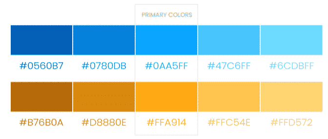
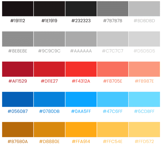
#Colors
Black, for power and sophistication.
Red, for the passion and ambition.
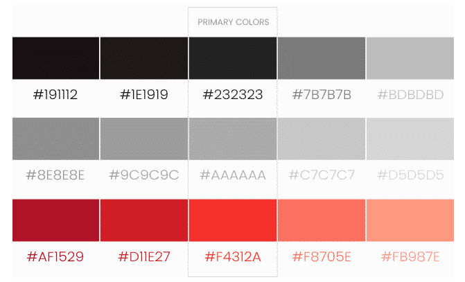
Blue, for intelligence and trust.
Orange, for creativity and warmth.
Communication
The primary colors are three – blue, orange, red – as well as black and white for the logo. The colors blue, orange and red are used in our communication in the graphic elements.

Iconography
Buttons and CTA are always in blue

Icons and its variations